 By Abdullah Ulber
|
Aug 07, 2021
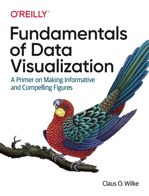
A few weeks ago I had the pleasure of reading the book Fundamentals of Data Visualization by Claus O. Wilke, published by O’Reilly in 2019. I found the book outstanding, and here is why.
Every data worker will eventually be asked to present existing or generated data in the form of charts. Unfortunately, data visualisation is rarely practised in school, let alone taught to the students. It is therefore no surprise that the vocabulary of chart types typically stops at line charts, bar charts and pie charts.
The book Fundamentals of Data Visualization gives a thorough and systematic introduction to the principles, methods and concepts of displaying data in the most pleasing, unambiguous and unbiased way. Right at the beginning, the book explains how data visualisation lies at the intersection of science and aesthetics, how it “is part art and part science”. Consequently, the bulk of what the book covers pertains to one of these aspects.
The first part starts off with a discussion of the generic elements of virtually any chart, namely axes and colours, and then leads the reader through a “directory of visualisations”. I was impressed to see this directory arranged not by the chart type but rather by the type of the data. The reader learns how to best visualise amounts, distributions, proportions, x-y relationships, geospatial data and finally, uncertainty.
The second part focuses more on the aesthetics of data visualisation. It explains, among many other things, the concept of proportional ink, how to deal with overlapping points, how to best choose colours, the do’s and don’ts of titles, captions, labels and tables, and how to maintain a good balance between data and context. The second part concludes with the mandatory admonition of gratuitous use of 3D effects, but not without giving a nod to the rare occasions where they are indeed justified.
In the third and last part, the author hoovers up some peripheral aspects that did not fit the first two parts. For me, this last part was the least beneficial of the entire book.
Almost every page of the book contains illustrations and examples that the author categorises as good, bad, ugly and wrong. These examples greatly support and reinforce the textual explanations.
In summary, I found the book Fundamentals of Data Visualization uniquely helpful, with plenty of takeaways and new information. I wholeheartedly recommend it to everybody in the business of data and can practically guarantee that your next chart will look better.


Book Review: Fundamentals of Data Visualization
A brief review of the book Fundamentals of Data Visualization by Claus O. Wilke.
read more
The successful day-to-day operation
The successful day-to-day operation of a university require an ongoing collaboration between different departments.
read more


